Hallowrealm is an asymmetrical warehouse-scale VR horror game that pits ghosts vs. ghost hunters. Being asymmetrical, ghosts have the unique abilities to fly and to become invisible when moving slowly. They can only kill a hunter if they grab them with their hands (tracked using a Leap Motion attached to their headset). Ghost hunters have a ranged energy pistol with limited but potent ammo, and an attached flashlight that flickers when ghosts are in their cone of vision. Physical contact between the two teams (most notably when ghosts are attacking hunters) does not occur, as the teams are split between two arenas equal in size and shape. At MassVR we developed Hallowrealm in a mere 3 months with a team of 5 developers. I was in charge of level design, but also helped considerably with overall game design, tech art, and environment art as we are too small of a team to get by without being multidisciplinary.
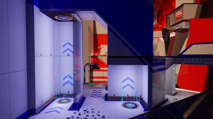
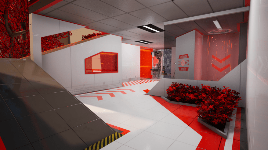
Part of the central gymnasium portion of the mapA Ghost HunterA Ghost
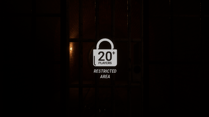
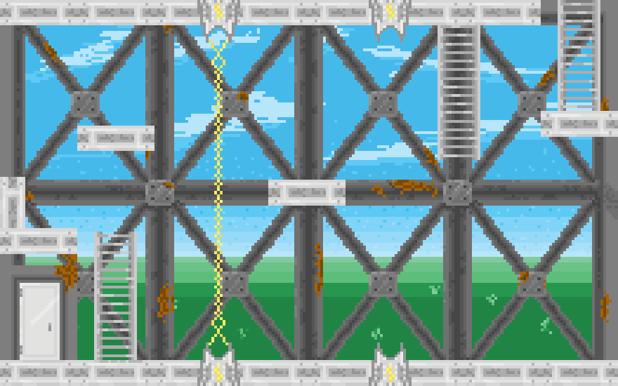
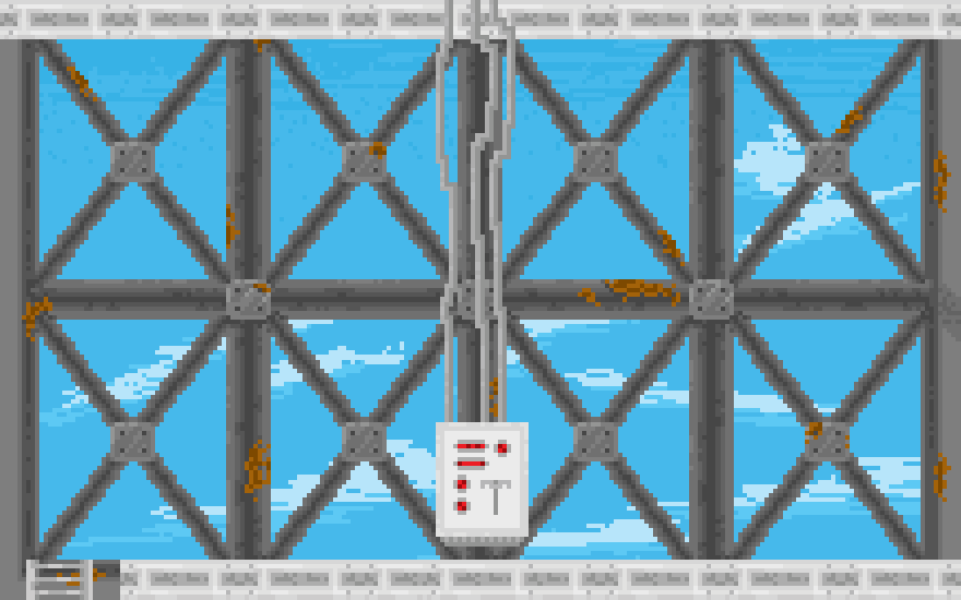
There were two major challenges when designing the map for Hallowrealm, both of which dovetail quite nicely. Our desired player count was 20 players (the max we had ever tried was 10), and we wanted one map that was optimally sized no matter the player count of a particular game session. This meant I had to design a massive map capable of providing engaging gameplay and exploration for 20 people that contained in it areas that would do the same for 2 players, or 5 players, or 8 players, or 12 players, etc. The final map is roughly 10-11 times the size of the physical play space (itself being 112′ x 70′). How that was accomplished I won’t delve into on this site just yet (simply due to my lack of free time), but I will briefly explain how the map adapts to player count below.
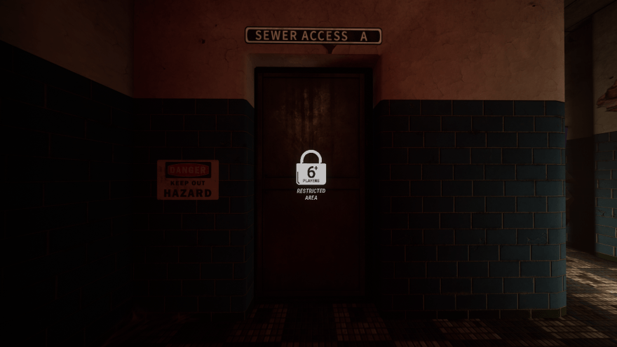
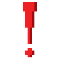
When exploring Hallowrealm‘s map, you’re bound to run into closed off doors with the icon above glowing at their center. This icon appears whenever a player gets close to the entrance of an area that is only open to x number of players. In order to meet the goal of our map supporting any number of players up to 20, I created two UE4 Blueprints: a “BP_Dynamic_Level_Obstacle,” and a “BP_Level_Obstacle_Manager.” Dynamic Level Obstacles are what are shown in the above two screenshots—doors, debris, window panes, vent grates, etc. that physically block off access to a section of the map. They have a variety of customizable settings, and “open” at whatever number of players a designer chooses. The Manager for these Dynamic Level obstacles handles an array of them all, calling “Open” or “Close” on them based on the number of players it receives from the game state. It runs through this process only during the “suit up” portion of the game (before match time begins, while players are putting on their backpacks and headsets) so as to not call “Close” and block people off from an area they managed to wander into.
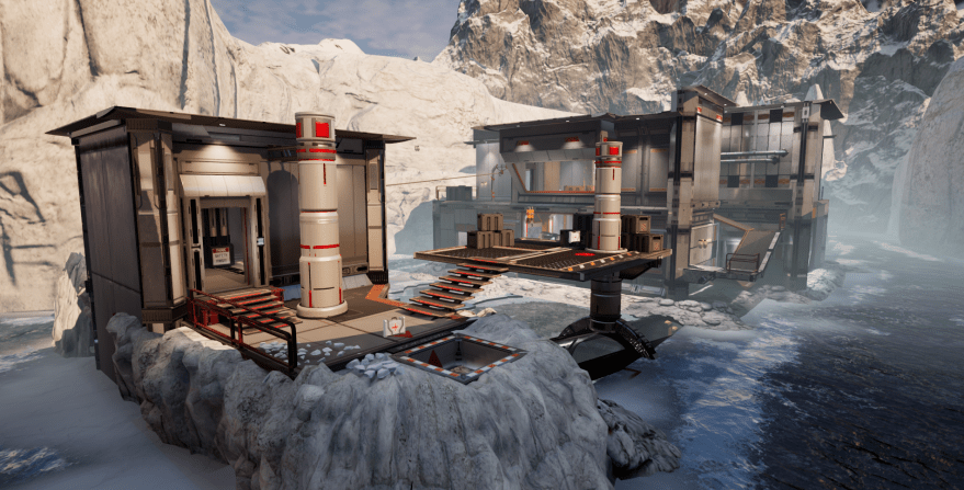
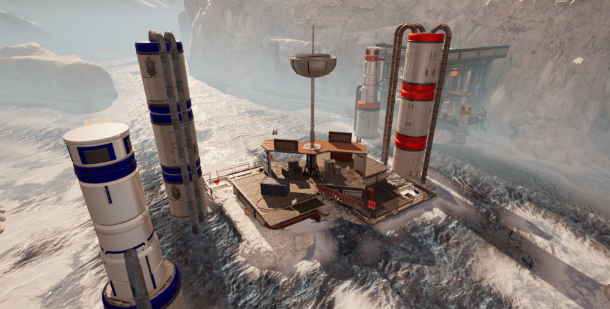
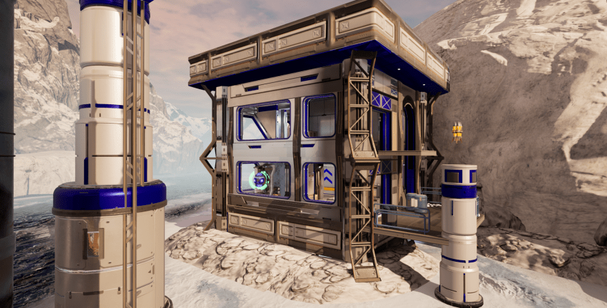
For the past few months I have been hard at work on two all-new multiplayer maps for VR Champions. One is for our current flagship location in Skokie and the other is for our sister location in Bloomington. They are arctic themed and meant to cater more heavily to repeat competitive play. As of yet they are not finalized, optimized, or named, but I have some screenshots I felt would be worth displaying here to chronicle my progress.
The public playing the first game of opening day in our 7000 sq. ft. upstairs arena
MassVR is free-roam virtual reality at massive scale. We use a mix of consumer and proprietary technology to make it possible.
I joined the team at MassVR in April of 2018, a couple months before graduating. I was brought on during the planning phase of the team’s next project to work as a level design and 3D artist—chosen for my previous work on Elements Tower Defense VR and familiarity with Unreal Engine 4 (UE4) and Maya. Below is a promotional video we recently put together to explain what MassVR is all about:
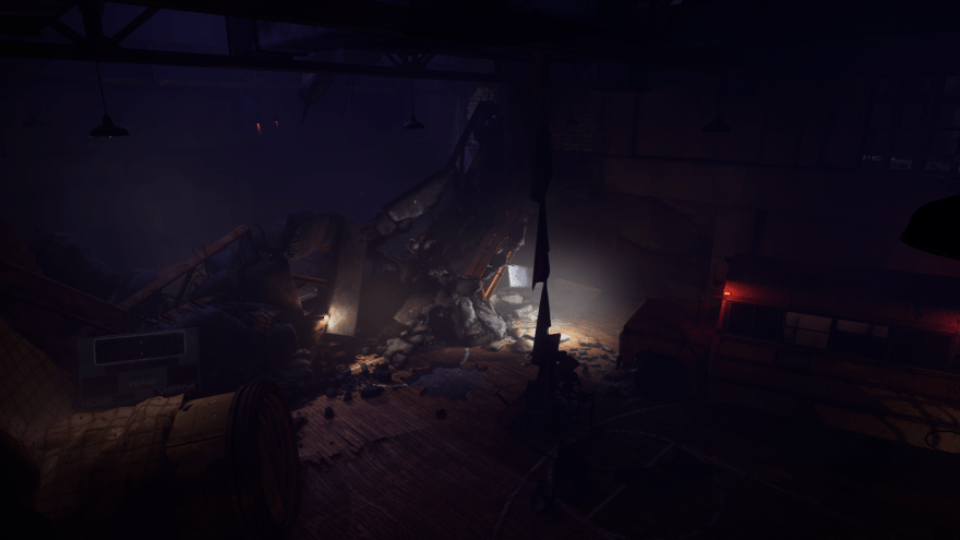
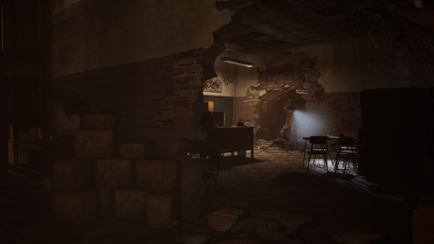
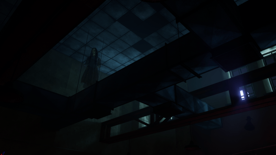
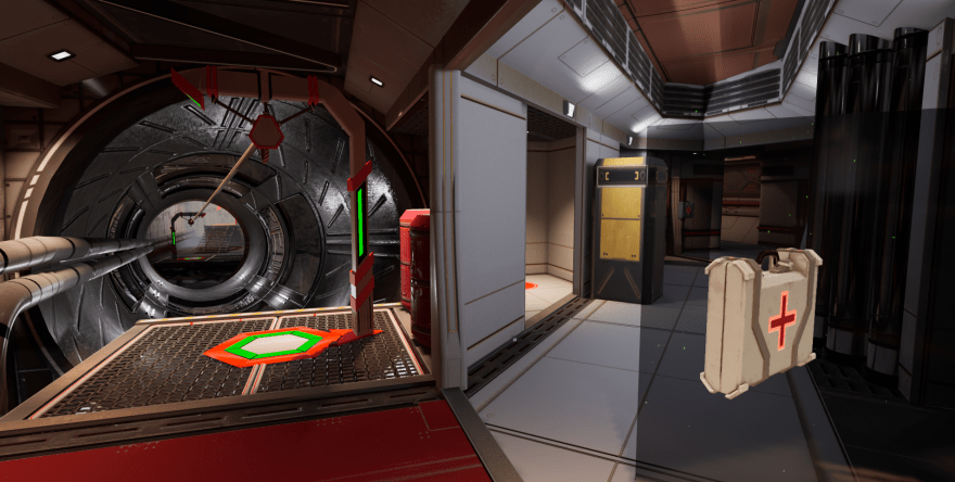
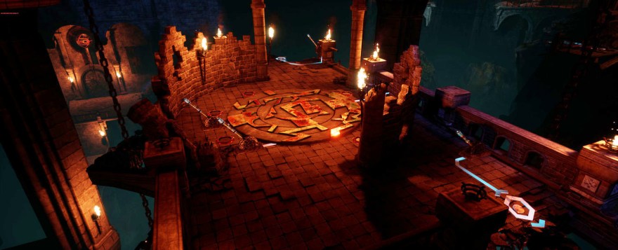
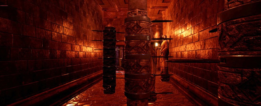
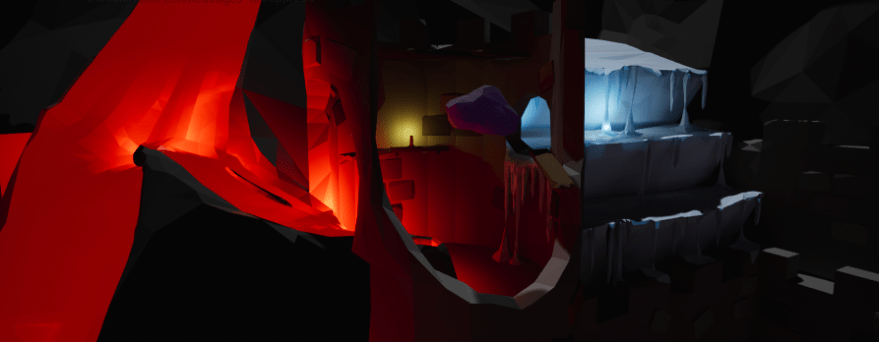
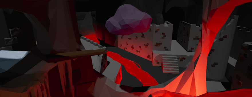
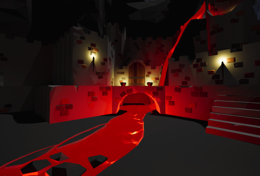
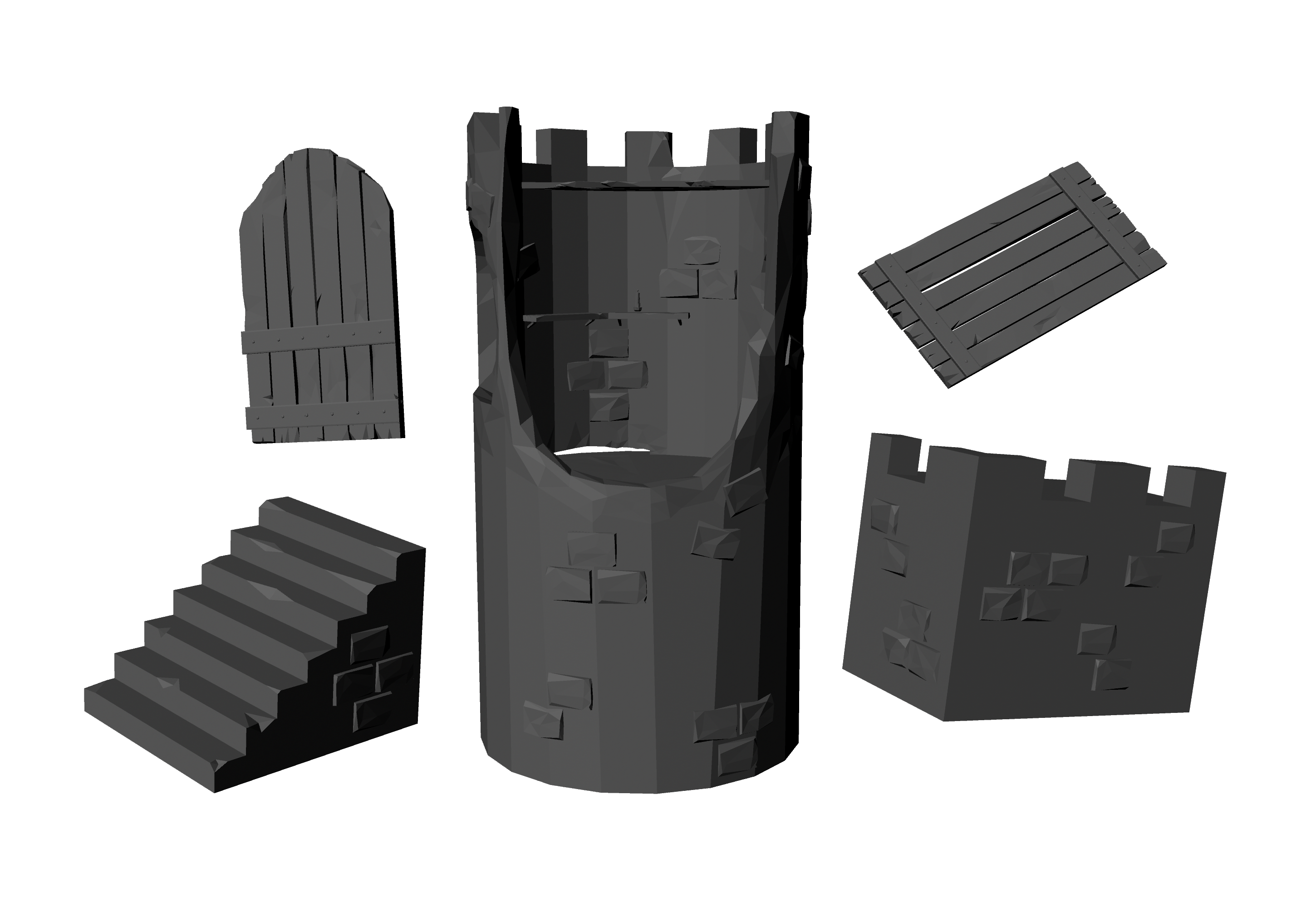
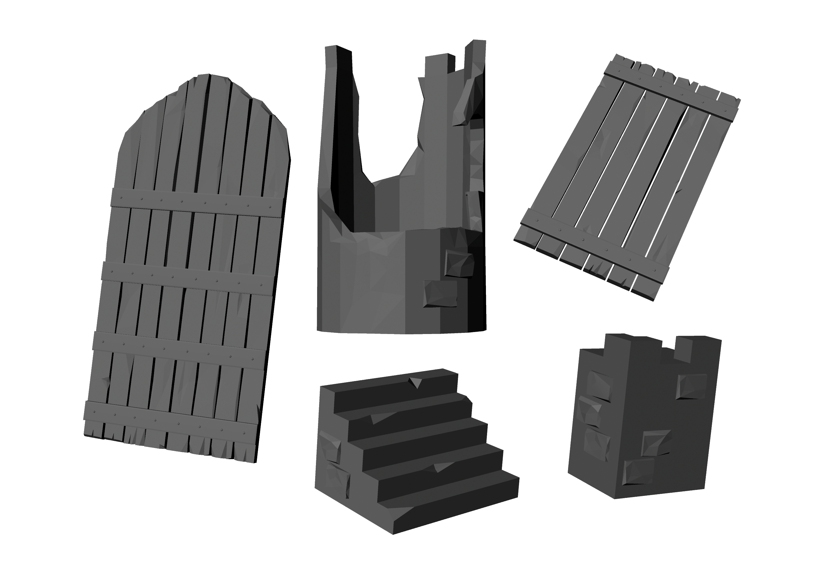
MassVR’s upcoming project, tentatively titled Heroes of Magic was my focus from April 2018 to October 2018. The title is a cooperative 2-4 player magic- and fantasy-themed puzzle game with light combat.
I worked on Heroes of Magic in UE 4.19 with 3D modeling done in Maya for any custom assets we needed. I helped to write the project’s GDD and designed (in part or in full) all of the game’s sprawling levels and the puzzles and combat scenarios contained within.
An early look at the planning I did for the design of “Checkpoint 3” of Heroes of Magic
With such a small team (six people), my responsibilities run much broader than just a level designer or 3D artist. I created the majority of the title’s particle effects using UE4’s Cascade (for our magical spells); used UE4’s Blueprint system to create environmental traps (like the ones pictured above) and interactive objects; and animated various cinematics using UE4’s Sequencer tool.
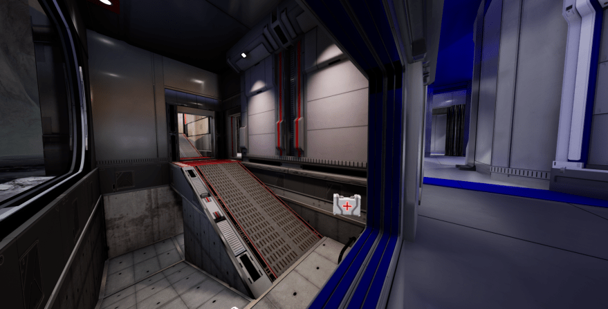
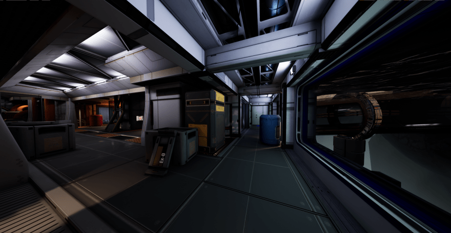
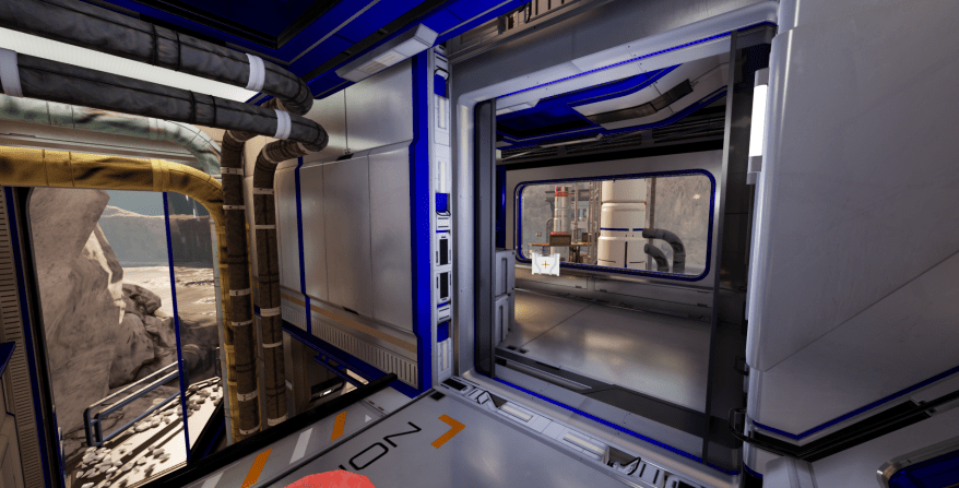
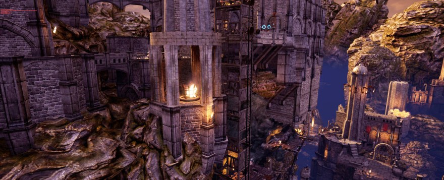
The constraints posed by warehouse VR game design are incredibly unique and demanding, and have been deeply rewarding to tackle. With Heroes of Magic we sought to create a massive and sprawling game world, with a relatively non-linear layout and a lack of loading screens or obvious transitions. We deployed a great number of unique tricks to make our roughly 35 ft x 70 ft warehouse into a seemingly infinite space for players. Our full warehouse was roughly 70 ft x 70 ft, but our goal with Heroes of Magic was to have two sessions of the game running at one time, side-by-side in a single warehouse space.
We started the project with our target headset being the Oculus Rift (shown in all the images on this page), but pivoted to the Samsung HMD Odyssey roughly a month into the project due to its superior motion tracking (with built-in cameras) and higher resolution (1440 x 1600 vs 1080 x 1200). The disparity between these headsets cannot be overstated. Samsung’s hardware along with Microsoft’s Mixed Reality drivers are significantly better in every way than the current Oculus drivers for our unique warehouse VR setup. Attached to the Odyssey is a Leap Motion camera, whose data we use for non-dominant hand tracking without the need for a controller.
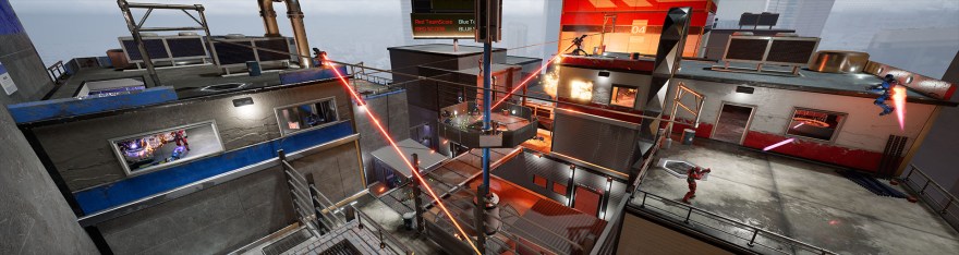
In October we wrapped up a vertical slice of Heroes of Magic and shifted focus to VR Champions, the multiplayer shooter shown in the videos at the top of the page and the images further down.
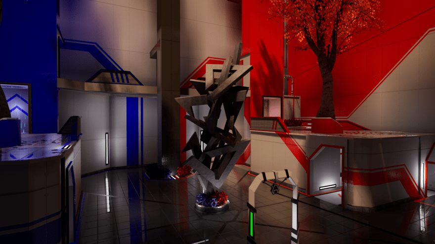
Pivoting the team to VR Champions included new map creation, a full refactor of the game’s art style, and gameplay redesign and rebalancing among other things.
The original art style for the game was much more industrial, and is (unfortunately) showcased in the recent promotional video I embedded at the top of the page, and the image to the left.
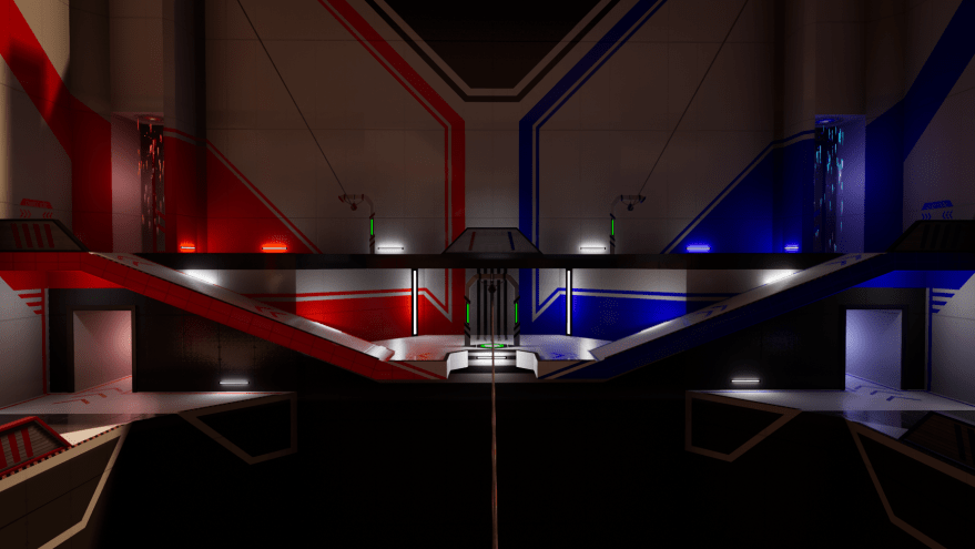
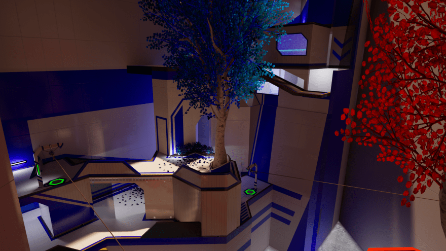
Our new art style is entirely different; we decided upon a cleaner, more modern aesthetic to bring the game greater cohesion and to emphasize its futuristic nature. We drew heavy visual inspiration from Mirror’s Edge, Halo, and Portal.
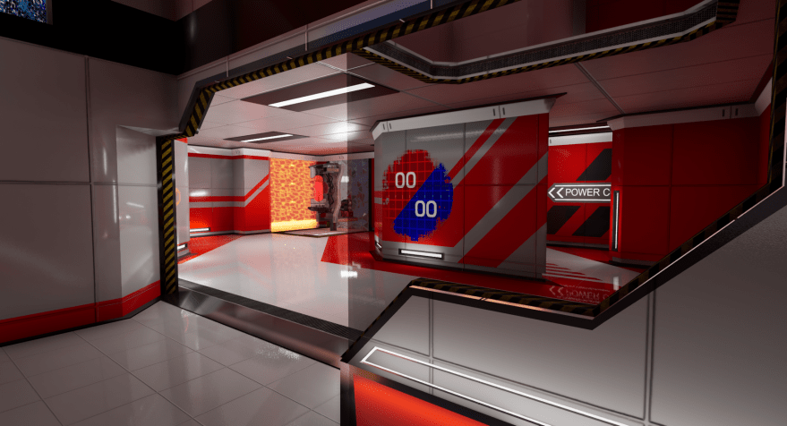
Our efforts to improve VR Champions were set to coincide with the opening of a new MassVR location with four full warehouse spaces, a notable upgrade from the single warehouse we used to have. Unfortunately, those new warehouse spaces all have slightly different
dimensions and column placements, necessitating a map redesign to maximize potential and keep players safe.
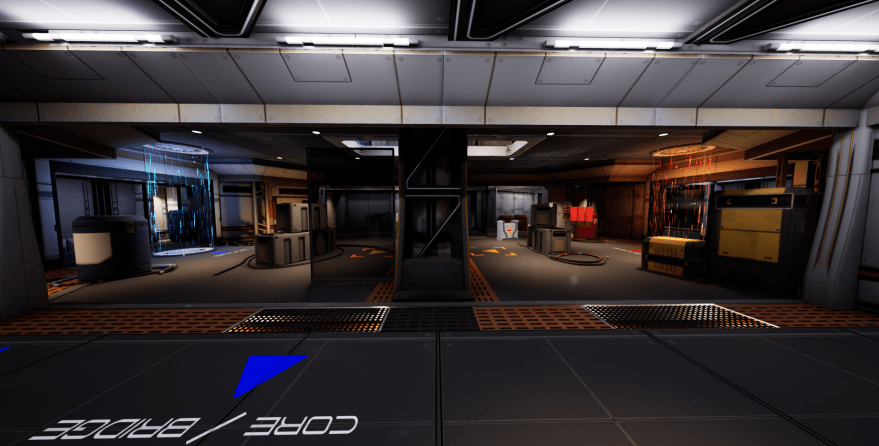
I was (and am) fully in charge of the game’s map design—from the initial sketches, to the grey boxing and testing, to the final detailed modeling of all assets. So far I have created three new maps for VR Champions: one for our two upstairs arenas, one for our two downstairs arenas, and one for our sister location that is opening soon in Bloomington, IL.
I outline my design process below.
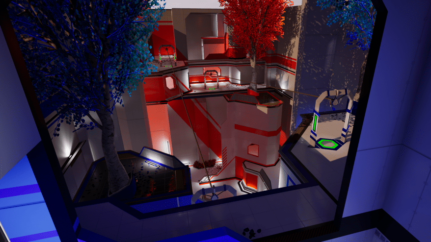
Concourse
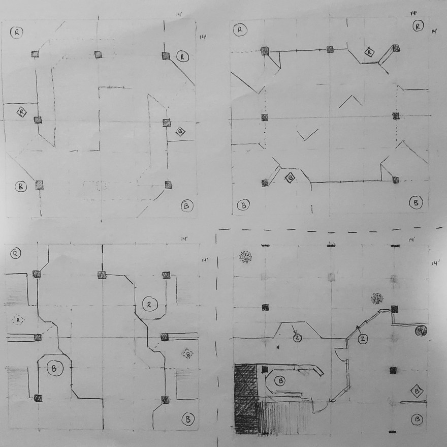
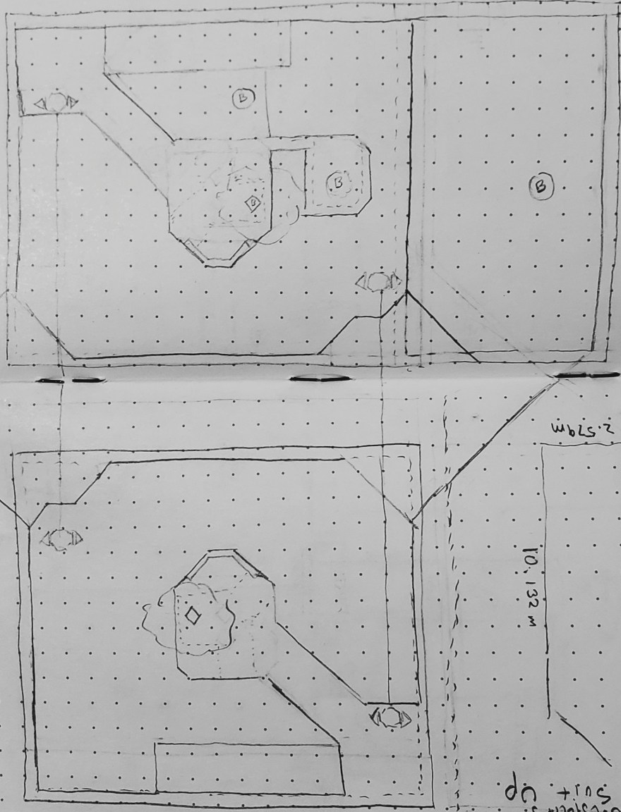
The map that became Concourse started as most traditional level designs do: as a paper sketch. The only caveat was, of course, that this was a MassVR level, so it started as a paper sketch with hard dimensions and structural columns I had to design around. This is something I never thought I’d have to think about as a level designer but it’s a constraint that truly pushes me to be my most creative. Below is an outline of the process that led to the finished design of Concourse.
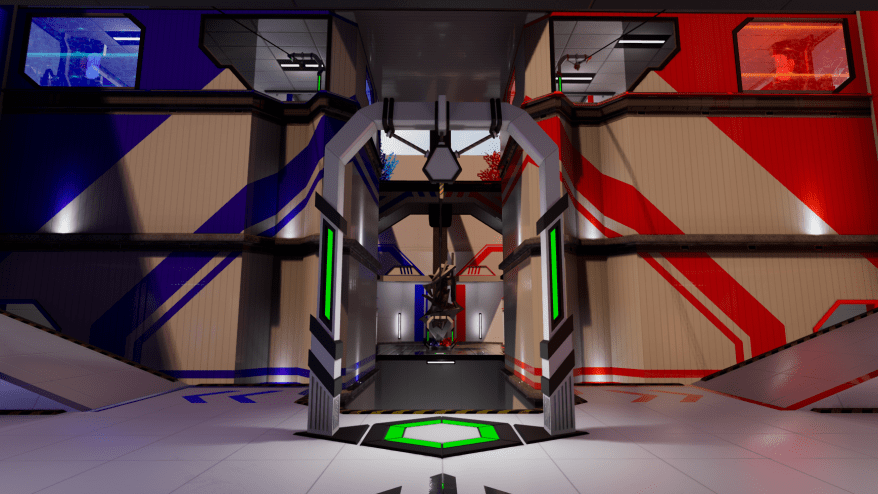
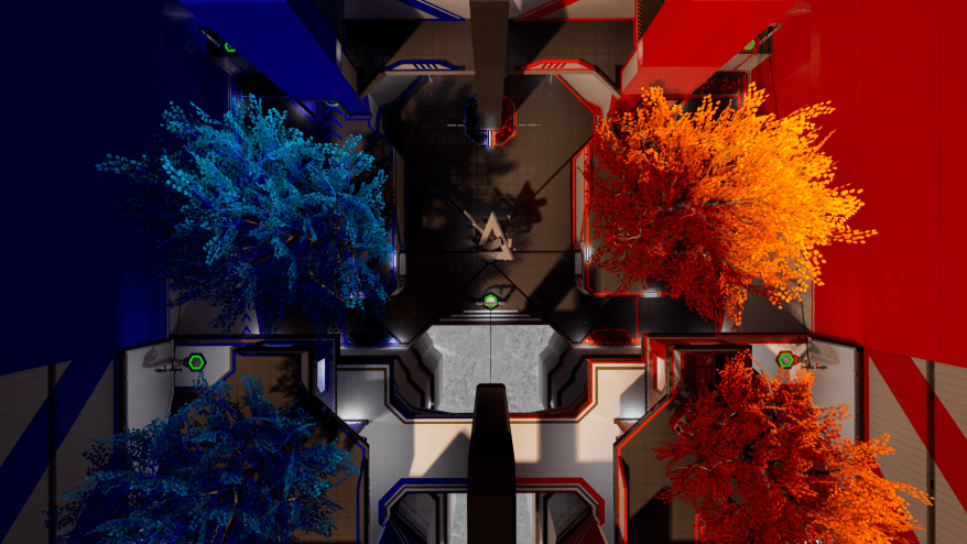
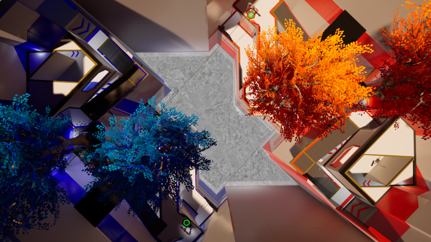
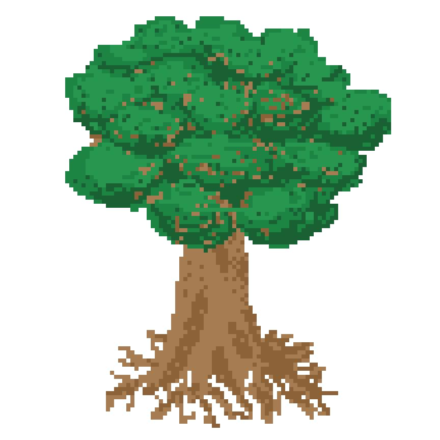
Our downstairs arenas are 112 ft x 70 ft with six structural columns off-center. Priority number one was making sure the map felt open even without hindering the safety of players. My initial idea was to hide the columns in the trunks of trees, creating a rooftop garden in the center of the map. For each teams base, I would hide the columns in conveniently placed walls. Above my first quick sketch, which I fleshed out more below.
I liked the direction I was headed with the more detailed layout above, but wasn’t entirely thrilled with this design so I expanded upon it below in another sketch.
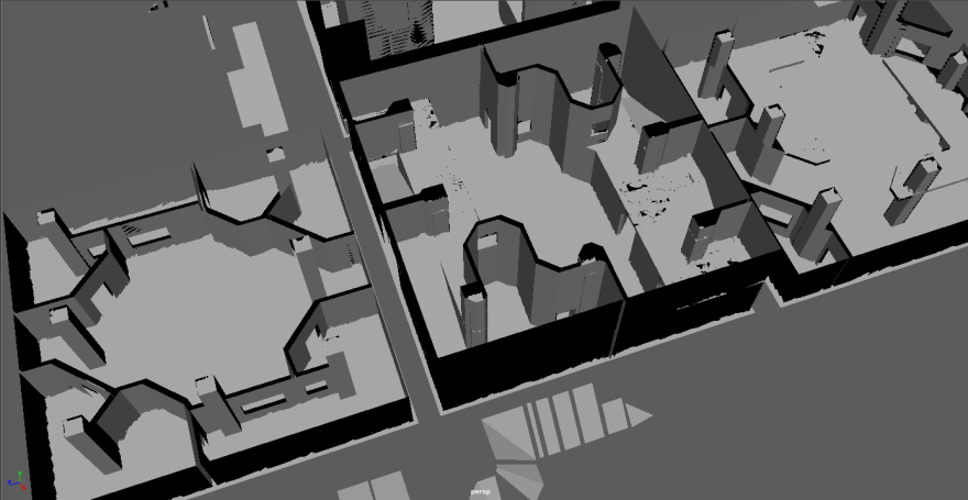
I liked where things were headed now, and used these two sketches as the basis for a UE4 brush buildout (shown below).
Things still just didn’t feel totally right. The map felt a little empty, the trees—while pretty—hindered visibility from each team’s base, and the basement section was wholly unnecessary. It was back to the drawing board.
I liked this design much better already, it was far more open and made better use of the columns. I eagerly opened up UE4 and went back to work creating a brush version of the map.
Seeing the 2D sketch come to life solidified this iteration for and for the rest of the team—this would be the first map for our downstairs arenas, and we’d call it Concourse. I immediately opened Maya and began work on the finished product. The finalized map is shown below.
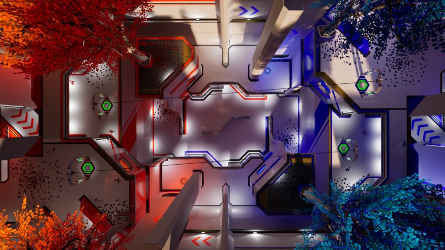
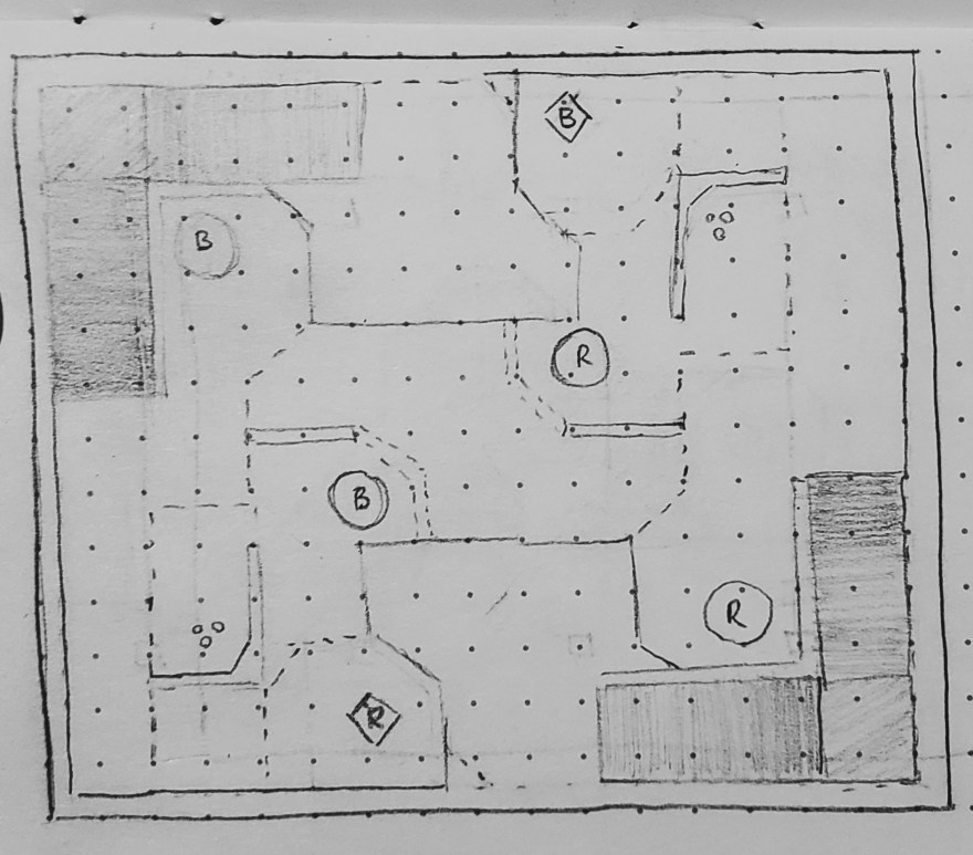
Vantage
I won’t detailed the entire process for this map, but I’ll show the design milestones.
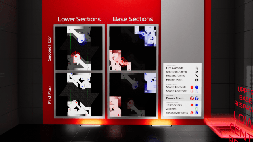
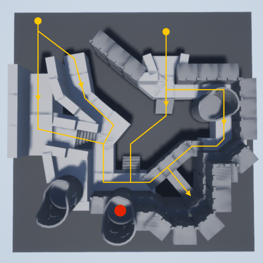
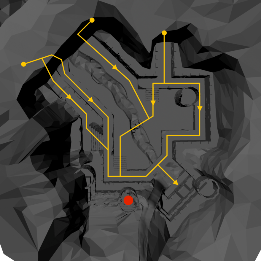
An in-game map overview players can view whenever they have the misfortune of dying
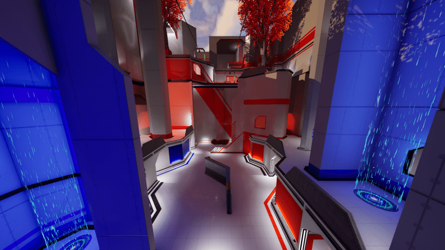
Crossfire
I also designed a full competitive ranking system for our players. This ranking system will allow us to host tournaments every few months at our new location with the requisite competitive spirit. For inspiration I looked to Elo (used in Counterstrike among other games), Overwatch, and Rainbow Six: Siege. Complementing the ranking system are a XP leveling system, a kill streak system, and cosmetic tweaks—all my own designs.
I’ll update this post with further developments in both projects as they come. My work at MassVR has taught me an immense amount about game design, puzzle design, cooperative and competitive multiplayer map design, UE4, VR, Maya, Leap Motion and more. It’s been both trying and rewarding—and truly fun.
Sean, Joe, and Konrad needed a monitor for this backpack
I participated in this year’s Global Game Jam with my friend Brian Hussel and had an enormous amount of fun putting together our game Transmission Towers: A Tale of Tedium in the span of just two days and nights (from Jan 26 to Jan 28). I worked on all the art and animation in Photoshop and designed roughly half of the platforming challenges, and Brian did the coding in GameMaker.
The theme this year was “transmission,” so after about an hour of brainstorming we settled on the silly idea behind our game. Open-world games have suffered from the same repetitive, often vacuous design philosophy for at least the last 6+ years; a great many being full of towers or viewpoints to climb to unlock a map full of dozens of meaningless collectible items. We decided to satirize this design philosophy.
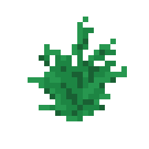
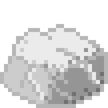
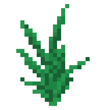
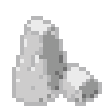
In Transmission Towers: A Tale of Tedium, the player is greeted with an endless, procedurally generated open world, populated with various tress, rocks and grass—all my own original sprite work.
They spawn close to a transmission tower and have a massive blue arrow at their feet pointing right at it.
We wanted to shed light on the obnoxious hand-holding that these games typically include.
The tower (and all subsequent towers) are a series of randomly generated platforming challenges. Each room in the tower was designed by either Brian or myself, but the order and number of rooms in each tower is random, up until the top room where the player always reaches an empty room with a switch, which then unlocks more of the map and another transmission tower.
The arrow at the player’s feet then resets to point towards this new tower.
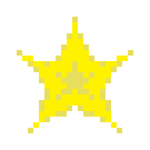
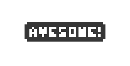
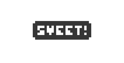
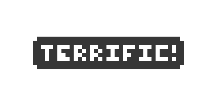
Getting to the next tower is deliberately tedious (hence the game’s title), but don’t worry! The map is full of collectibles, and outposts to liberate! There are three unique collectibles, the !, ?, and star, shown below, each producing a random word of encouragement when the player collects them.
The game tracks the number of collectibles you’ve collected, but it does only that. It’s simply a nice number to keep increasing.
There are also outposts to liberate—meaning that you walk over a sprite of an outpost, the black flag they’re flying turns white to signify surrender, and the game prompts you with a wonderful “OUTPOST LIBERATED!”
Deliberately pointless and silly, this is meant again to satirize the frequency at which open-world games throw copy-and-paste ‘bandit camps,’ ‘outposts,’ or ‘fortresses’ to try to keep players occupied as they traverse an otherwise bland and empty world.
Below is a taste of all the wonderful words of encouragement Transmission Towers: A Tale of Tedium throws at players:
It’s possible but unlikely Brian and I will ever completely finish the game, but we were able to get nearly everything we wanted into it by the 3PM Sunday deadline. Working without any real breaks for 48 hours straight (getting only ~6 hours of sleep total) was a strangely rewarding experience. I was able to see what I’m capable of at the extremes of my own creativity, and ended up quite satisfied. I was so focussed for so long that I was able to finish all the art we needed (including a menu just to spruce things up) all while having time to help Brian a great deal with level design.
Elements Tower Defense VR recently won Best Game at Miami University’s 2017 Student Game Awards. We are all immensely proud and grateful—and excited for what the future holds for Elements.
This is our pre-alpha trailer. I’ve since added destructible meshes for all enemies and additional particle effects for lightning and icicles, but the footage in this trailer was taken before said additions. I was in charge of making the trailer above; including recording my own gameplay, editing the raw footage in Adobe Premiere, and designing the game’s logo. The music is not my own however, it’s a goofy track YouTube gives to creators for free.
Elements is an Unreal Engine 4 virtual reality tower defense game that remains the extracurricular focus of myself and two of my friends/classmates. All of the modeling and animation for Elements is my own work, done solely in Maya. Blend spaces for the animations of two of the enemies were subsequently made in UE4.
ART DIRECTION
In addition to modeling and animation, I was tasked with the lighting and texturing of the game and, as a result, I decided the overall art direction. I chose a low-poly style to maximize performance in VR as well as to make sure objects/enemies are easily distinguishable from a distance in the headset (currently, even with a 1080×1200 resolution for each eye, the Vive is noticeably pixelated). Not only that, but I’m a huge fan of stylized artwork, especially in games like Journey, Job Simulator, or The Witness.
Below are some UE4 shots of Elements with full resolution, color, and lighting.
LEVEL DESIGN
Below I’ll explore how the game’s level, its play space, and its art style evolved over time. We took play tests very seriously, constantly iterating to optimize for fun.
As you’ll see from the second to the third iteration, I increased the size of the door the player was meant to defend. Below you’ll see I also increased the size of enemy pathways. The door size increase served two purposes: to be more visible and exciting for the player; and to allow more enemies to attack it at once. The enemy path size increase was done for three reasons: to accommodate more enemies; to make pathfinding easier for our AI system; and to reduce clipping and snagging that was occurring between the enemy models and the environment.
The images below show in detail how the layout of the map changed with each iteration. The first was done as an imprecise white-box mockup (including early placeholder assets) in UE4 for testing, and the second was a full modeling pass in Maya. The player area is shown in red, and the spawn points and paths of the enemies are shown in yellow.
Later in the project we decided we wanted to add more traditional tower defense items (placeable turrets, traps, etc.) so I did another rework, adding flat areas (show in green) that were optimal for placeable items.
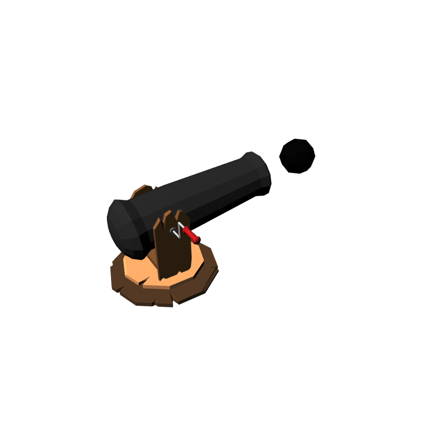
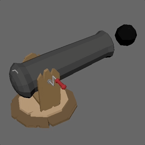
Placeable items have gone through multiple iterations and are not fully implemented as of yet, but here is initial cannon asset I modeled and animated as a proof of concept:
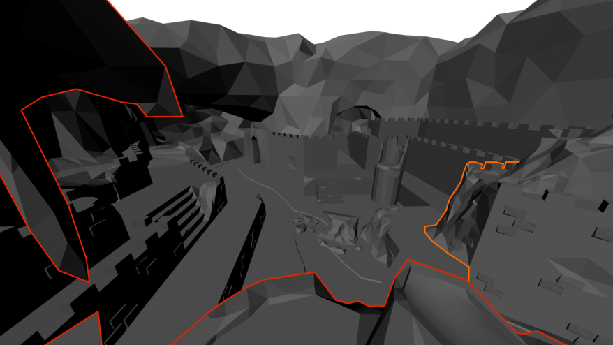
A major issue that was ran into throughout development was the play space tower and how it effected the player’s FOV. It took many iterations, but with my final design I was able to give the player full view of the level while keeping the location of the interaction objects (lighting cloud, icicles, and meteor/lava pit) in easy reach.
Below are screenshots exemplifying how the view from the play space (show in red) was changed over time. The orange corner became an issue later in development when we realized it also served to unreasonably obstruct the player’s view. In my most recent Maya pass over the level, I fixed this as well.
ENEMY MODELS & ANIMATIONS
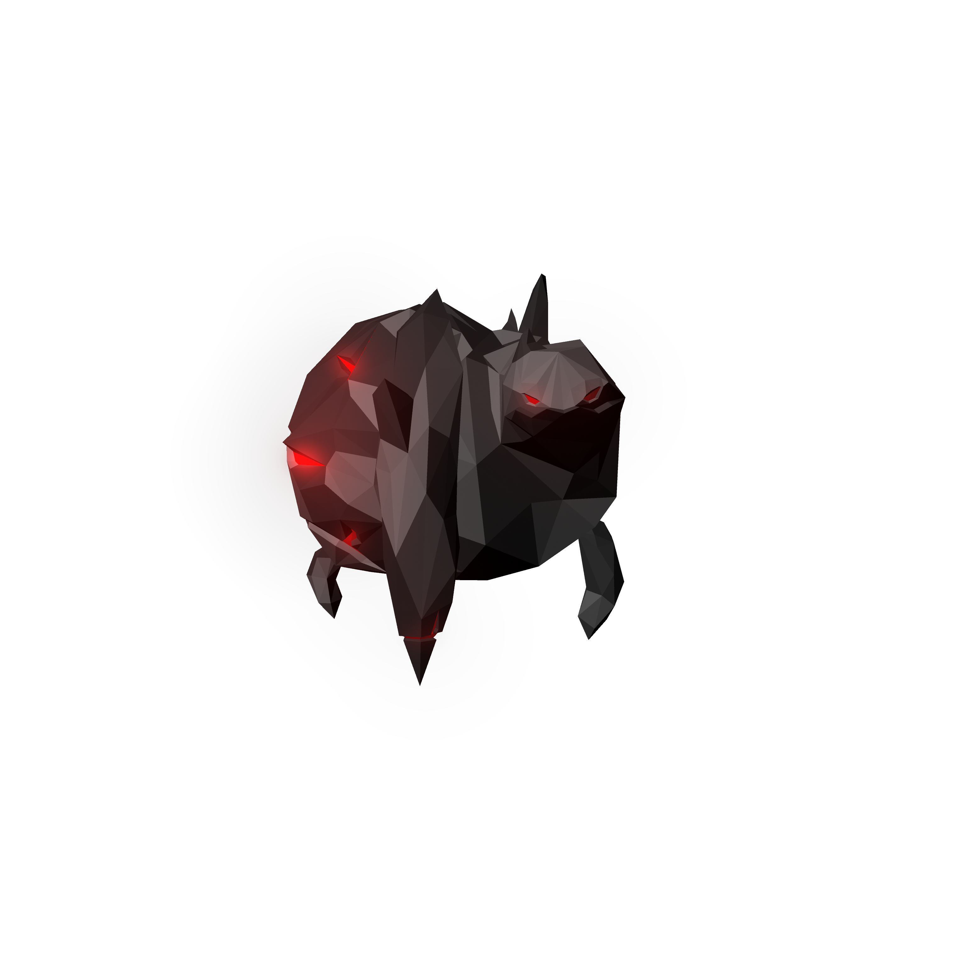
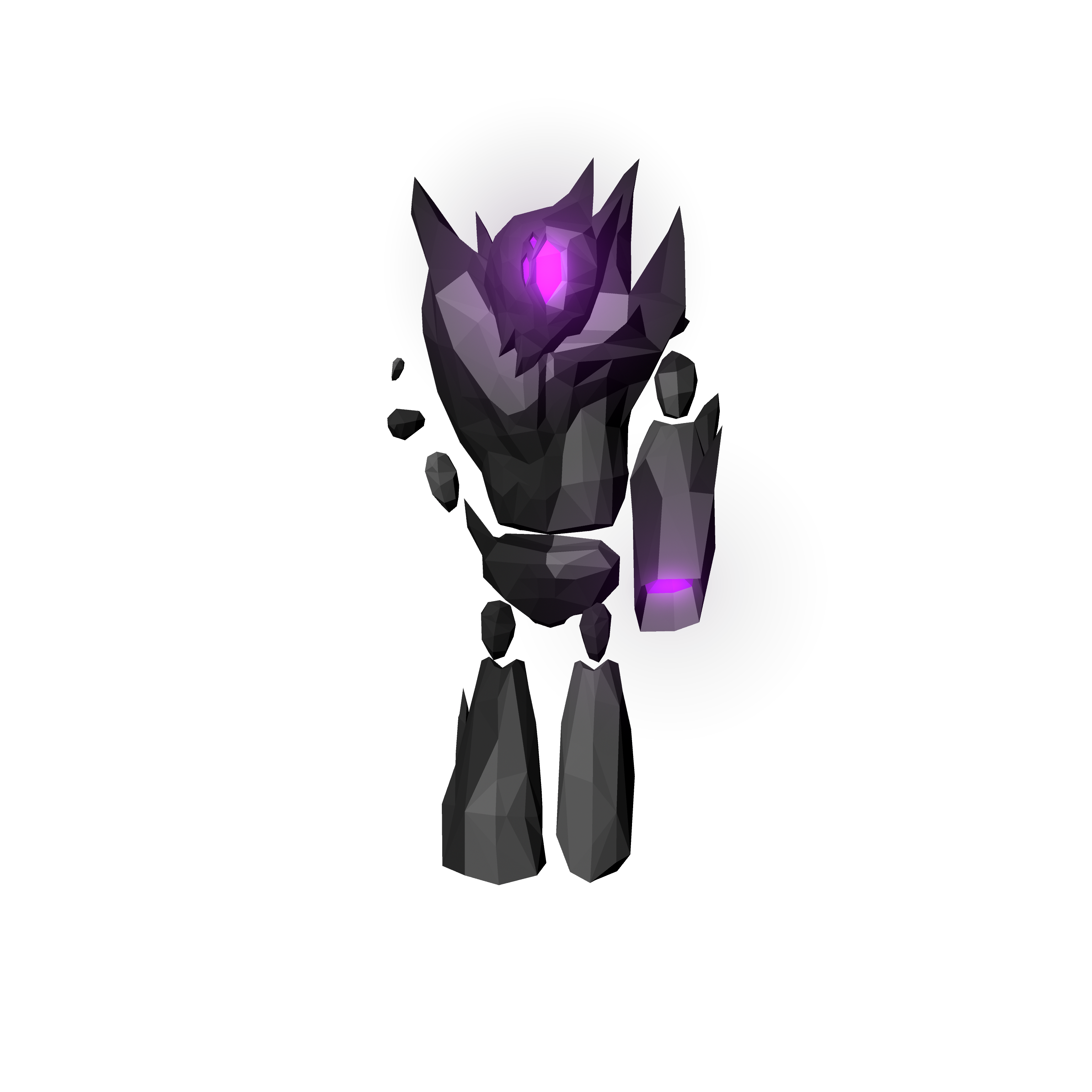
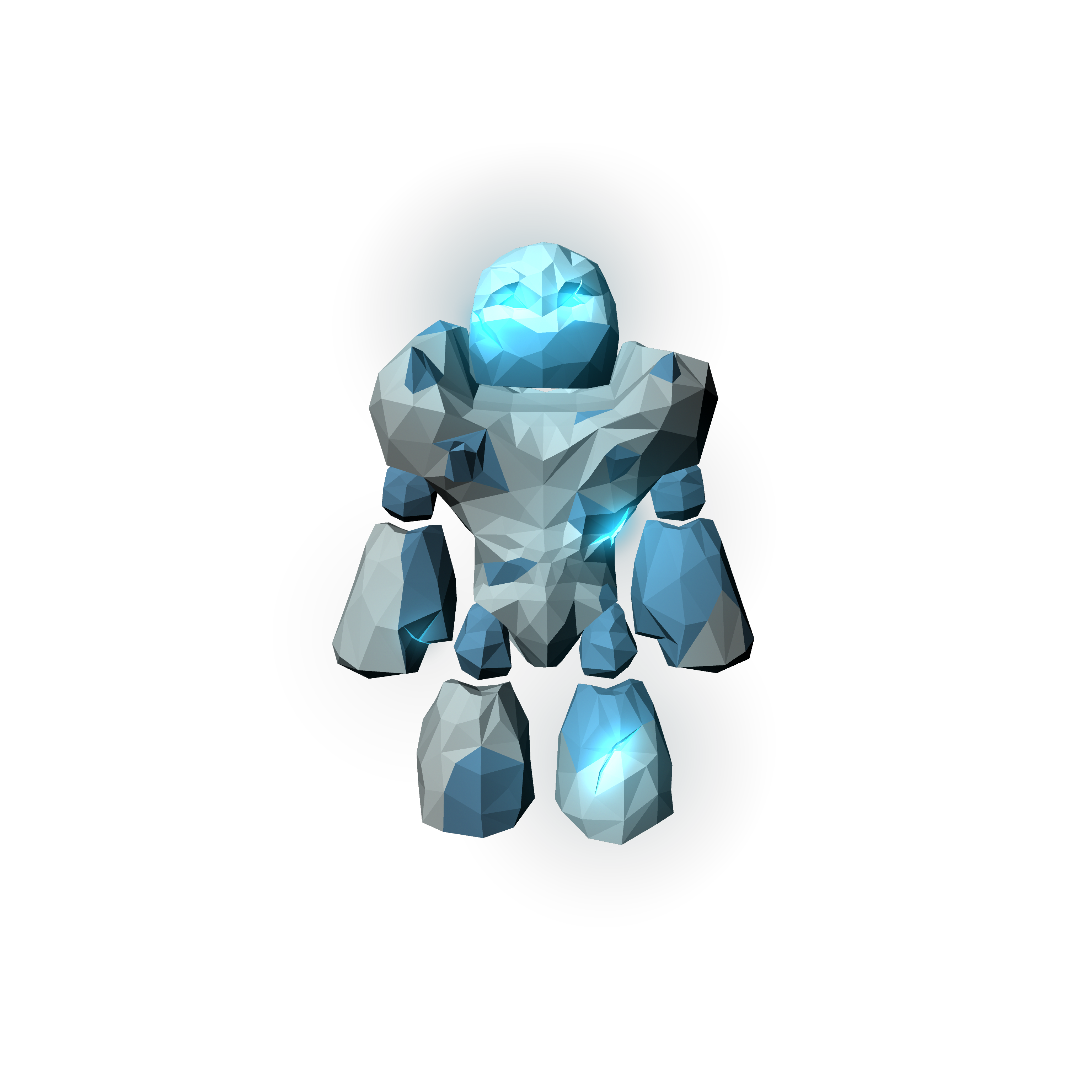
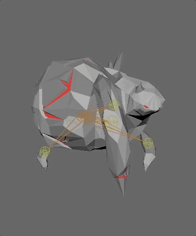
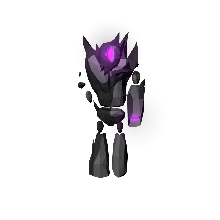
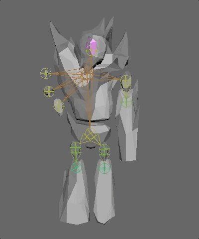
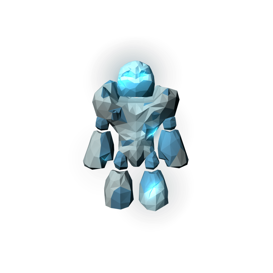
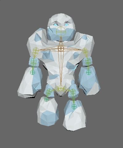
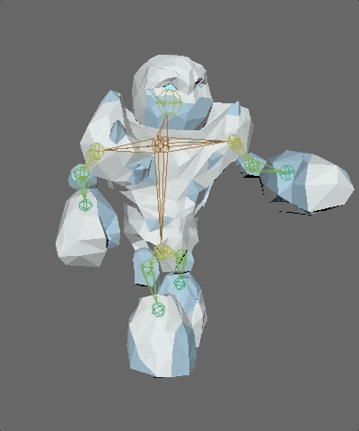
There are currently three types of enemies in the game, from left to right: a fiery, explosive small enemy that blows itself up once it reaches the door; a medium enemy that stands at a short distance from the door, extending its single arm to shoot an electric beam that inflicts gradual damage; and a large, lumbering ice golem enemy that does devastating melee damage to the door if it manages to reach it. I modeled, textured, rigged, and animated each of them myself.
I only had to do a walk animation for the small enemy as I created a destructible mesh in UE4 for the enemy’s attack. I applied force and a particle system to the destructible mesh to create the explosion animation seen in the pre-alpha trailer.
The medium enemy required an idle animation (if it were to be queued behind another enemy, or stuck for a time on its path). I created a blend space in UE4 to transition between its idle and walk animations.
The large enemy took the most time and iteration to get right. It required not only the most detail, but the most animations as well. I created three UE4 blend spaces for this enemy, an idle-walk, walk-attack, and idle-attack.It took a while for me to decide on what head I wanted the large enemy to have, and how much detail to include in its torso. You’ll also notice below that the large enemy was initially designed to be lava-themed. This was changed to ice once I created the small enemy. After all the changes, though, I’m happy with the model I’ve settled on thus far.
Spellslingers is a 2-4 player 2D competitive multiplayer platforming game that I and two friends made as a student project.
This was our first foray into creating a full-fledged video game and we were quite pleased with the result. We designed it for PC using GameMaker Studio, targeting controllers as the optimal input method. We hoped to get back to it at some point, but instead we moved on to something new—Elements Tower Defense VR. My contribution included on icons, spell sprites, and animations. Here is a trailer of the game that I edited in After Effects for our final presentation (“Sequence” was our “team” name, the logo is of my design):
Players are first greeted with a character selection screen where they may choose how they look and what kind of spells they want to use. Each spell has a unique look and effect that fits within its element (fire, ice, and electricity); we spent a great deal of time play testing amongst ourselves and friends to properly balance each and every spell. In total there are nine spells, three for each respective element, each of which I designed in Photoshop.
We also incorporated a spell buffing system in which the leading player’s chosen elemental buff would kick in at a certain score threshold. This buff would effect all spells of its type (so the fire buff would effect all fire spells, the ice buff all ice effects, etc.) which forced players to be very strategic in their choices—they wouldn’t want to choose a buff that may effect many of their opponents’ spells.
Making Spellslingers was an extremely rewarding and fulfilling experience, and one that taught me a lot. I learned the ins-and-outs of GameMaker Studio, honed my Photoshop skills further, and refined my time management skills. As a team we adopted a scrum-like workflow consisting of weekly sprints to make sure that we completed everything we needed to by the end of the semester. We didn’t fully meet our own expectations—especially in regards to the background environment of our stage—but we learned our own limits and the importance of a reasonable project scope.
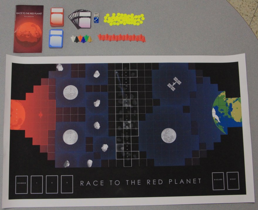
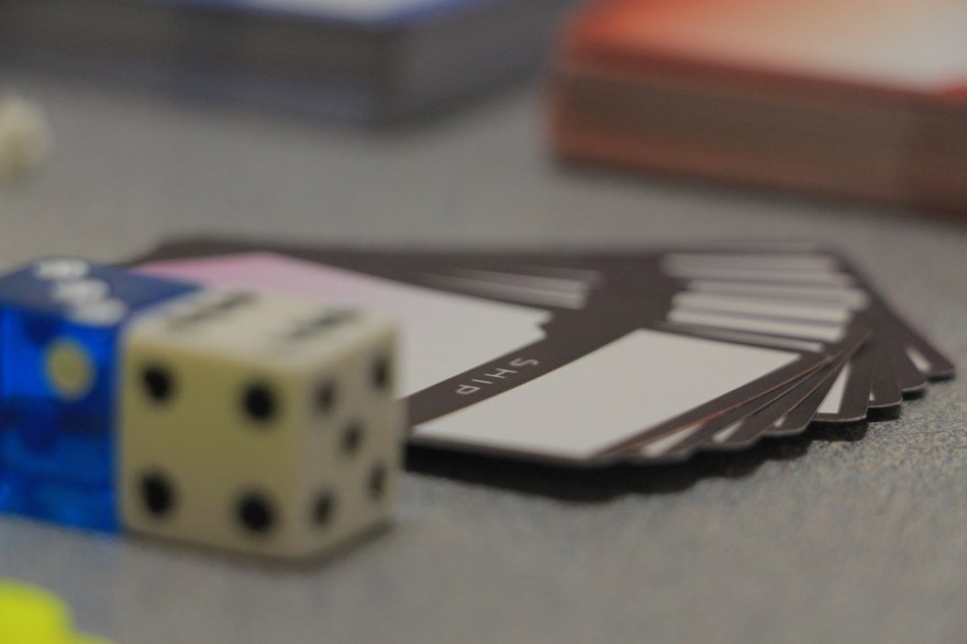
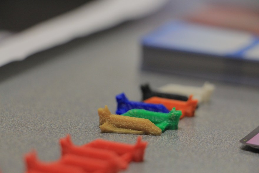
Race to the Red Planet is a space adventure board game I worked on with 3 friends for IMS 212 The Design of Play. We received an honorable mention in 2015 at the Miami University Student Game Awards for our work. In the game, players race their ships to Mars, surpassing obstacles and upgrading their ships along the way. Once they get to Mars, they must turn around and eliminate the competition. It’s a game inspired loosely by roguelike video games in that it is brutally difficult at first and gradually gets easier as you learn the ropes and identify the strategies of you opponents. Together, we spent hundreds of hours designing the game, my role consisting of graphic design, systems design/prototyping, and playtesting.
I helped to design the board and cards and fully designed and wrote the rulebook for Race to the Red Planet. We worked together to 3D print Maya models of our pieces to make the project as polished as possible.
Designing the game was a tough team endeavor that took us far more than the allotted class/homework time to complete. The results were worth the time invested however, and the experience is something I’ll always cherish. I learned very distinctly how to juggle different opinions and ideas and channel them into a single artistic vision. I learned that iteration is paramount when trying to reach the optimal outcome, and that even weird, peculiar, or unorthodox ideas can bear fruit if you don’t shoot them down right away.
Below is the video we produced outlining the rules of Race to the Red Planet, and gives a good look at all of the materials needed and our goofy freshman selves.
Event Card
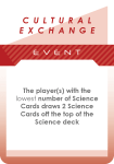
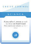
Science Card
Ship Card
All too often group projects for classes can become an exercise in futility, but myself and my three friends/classmates were able to work cooperatively to produce something we were very proud of and a game we still play time-to-time with friends, relatives, and housemates.
For reference, here is the game’s rulebook I designed and wrote:


 I worked on Heroes of Magic in UE 4.19 with 3D modeling done in Maya for any custom assets we needed. I helped to write the project’s GDD and designed (in part or in full) all of the game’s sprawling levels and the puzzles and combat scenarios contained within.
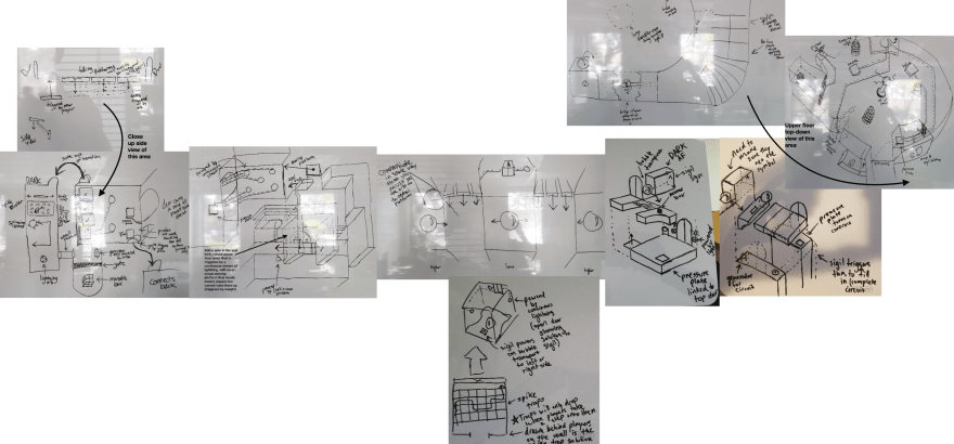
 With such a small team (six people), my responsibilities run much broader than just a level designer or 3D artist. I created the majority of the title’s particle effects using UE4’s Cascade (for our magical spells); used UE4’s Blueprint system to create environmental traps (like the ones pictured above) and interactive objects; and animated various cinematics using UE4’s Sequencer tool.


 Pivoting the team to VR Champions included new map creation, a full refactor of the game’s art style, and gameplay redesign and rebalancing among other things.


 Later in the project we decided we wanted to add more traditional tower defense items (placeable turrets, traps, etc.) so I did another rework, adding flat areas (show in
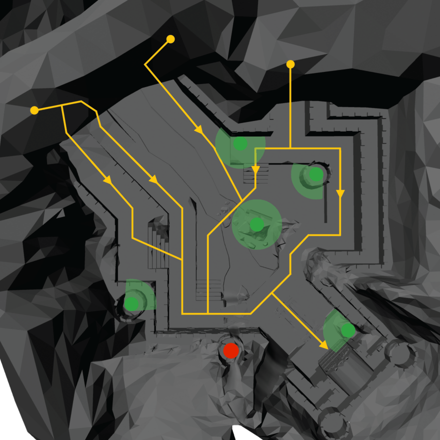


 It took a while for me to decide on what head I wanted the large enemy to have, and how much detail to include in its torso. You’ll also notice below that the large enemy was initially designed to be lava-themed. This was changed to ice once I created the small enemy. After all the changes, though, I’m happy with the model I’ve settled on thus far.
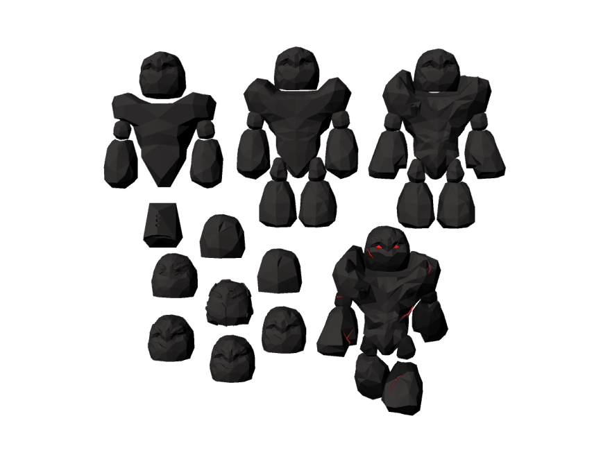


